Why Map Your Wi-Fi?
Ever felt like your Wi-Fi signal is playing hide-and-seek? I certainly have. Frustrated with spotty internet coverage throughout my home, I decided to take a more methodical approach – mapping my Wi-Fi network. The results were eye-opening and led me straight to the realization that an upgrade was desperately needed. Mapping your wifi mapping isn’t just about satisfying curiosity; it’s about optimizing your network for reliable connectivity. A poorly positioned router or interference from walls and appliances can significantly impact signal strength. By visually representing these areas, you can identify dead zones, understand where the strongest signals are, and potentially reposition your router for better coverage. It’s a surprisingly simple way to troubleshoot connectivity issues without resorting to expensive equipment.
Tools & Methods for Wi-Fi Mapping
Several free tools and apps make wifi mapping accessible to everyone. Here’s a breakdown of popular options:
- NetSpot (Windows/macOS): This is a robust option offering both free and paid versions. The free version allows you to survey your network, visualize signal strength with heatmaps, and identify areas for improvement. It’s user-friendly even for beginners.
- WiFi Analyzer (Android): A popular Android app that provides real-time Wi-Fi analysis, including channel utilization, signal strength graphs, and access point information. While not a full heatmap generator, it offers valuable insights into your network environment.
- Acrylic WiFi Home (Windows): Another free Windows application that creates detailed heatmaps of your wifi coverage. It’s known for its accuracy and ability to identify interference sources.
The process is generally straightforward: Download the app or software, connect to your Wi-Fi network, and then walk around your home with your device (phone or laptop), recording signal strength at various locations. The tool will then generate a visual heatmap representing these readings.
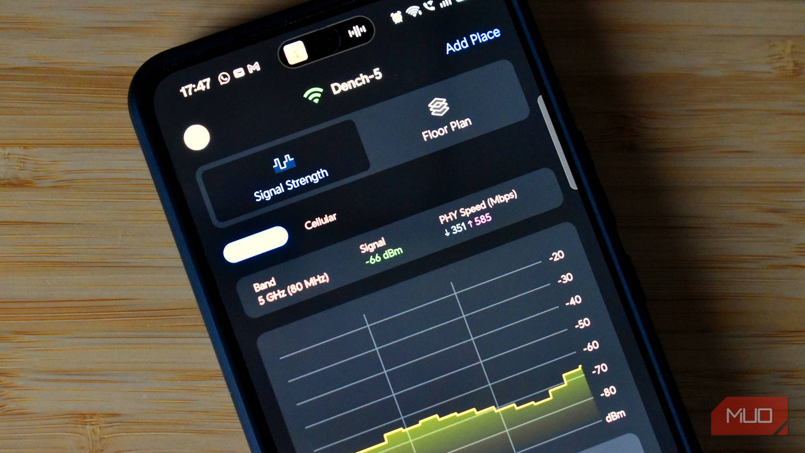
Understanding Heatmaps
Heatmaps generated by these tools use color coding to represent signal strength – typically green for strong signals, yellow for moderate signals, and red for weak or no signal. Furthermore, it’s important to consider the environment when interpreting heatmap data; walls, metal objects, and even certain types of glass can significantly reduce signal strength.


Choosing the Right Tool
The best tool depends on your operating system and desired level of detail. NetSpot is a great all-around choice for Windows and macOS users. Android users will find WiFi Analyzer particularly helpful for quickly assessing their network’s performance. For those seeking highly accurate heatmaps, Acrylic WiFi Home remains a reliable option.
Interpreting Your Wi-Fi Map & What To Do
Once you’ve generated your map, the real learning begins. Look for patterns and anomalies:
- Dead Zones: Areas with consistently low signal strength indicate potential coverage gaps.
- Signal Strength Variation: Significant differences in signal strength across short distances can point to interference or obstructions.
- Channel Congestion: If your map reveals a crowded wifi channel, consider switching channels on your router to avoid interference from neighboring networks.
Armed with this knowledge, you can take corrective actions:
- Router Repositioning: Experiment with different locations for your router, ideally in a central and elevated position.
- Antenna Adjustment: If your router has adjustable antennas, try angling them to optimize coverage.
- Mesh Network Consideration: For larger homes or areas with persistent dead zones, consider investing in a mesh wifi mapping system for more consistent coverage.
- Upgrade Router: As I discovered during my mapping process, sometimes the problem isn’t placement; it’s an outdated router incapable of providing adequate signal strength. My old copper connection was also a bottleneck, so that is getting upgraded too!
Conclusion: Taking Control of Your Wi-Fi
Mapping your wifi might seem like a technical exercise, but it’s an incredibly valuable tool for anyone experiencing connectivity issues. It empowers you to understand your network’s strengths and weaknesses, allowing you to make informed decisions about optimizing performance. My experience proved that even simple steps, guided by data visualization, can drastically improve your internet experience – and sometimes reveal the need for a bigger upgrade!
Source: Read the original article here.
Discover more tech insights on ByteTrending.
Discover more from ByteTrending
Subscribe to get the latest posts sent to your email.